

In today's competitive retail landscape, brick-and-mortar store owners must do everything possible to attract and engage customers. One powerful tool that can make a significant impact on foot traffic and sales is effective retail signage design. When done right, your signage can communicate your brand message, highlight your offerings, and ultimately drive more customers through your doors.
In this comprehensive guide, we will explore the key principles and strategies for creating compelling retail signage. From the importance of keeping it simple to considerations of typography, color, and visibility, we will provide you with valuable retail signage ideas and insights as well as actionable tips to elevate your retail signage game.
When it comes to retail signage, the KISS method (Keep It Super Simple) is a guiding principle that should always be implemented. Many store owners make the mistake of cramming too much information or imagery into their signage, overwhelming potential customers and diluting the intended message.
To create effective signage, limit yourself to including only what's truly important. Ask yourself, "What am I trying to sell?" and focus on that core message. You can tell customers who you are or what you do, but avoid overwhelming them with unnecessary details by answering both of those elements.
Since your sign is such an important piece of your advertising efforts as a retailer, collaborating with a custom signage provider that understands the power of simplicity is of the utmost importance. Look for experts who can guide you based on your industry or type of business, ensuring your signage includes the essential elements that will resonate with your target audience.
Your logo and typeface play a crucial role in your retail signage design. While your logo may look great on letterhead and marketing materials, it's essential to consider its dimensions when translating it to channel letters or a pylon sign. A logo that is too small or too big can lose its impact and readability. While you may love your logo design and want it on your marketing materials, it’s often not necessary to include it in a large format outdoor sign.
When it comes to typography, simplicity, and readability should be your guiding principles. Your signage typeface can be different from what's on your business cards and marketing materials. Factors like drop shadows, 3D effects, and reflections stand out in digital and even print marketing, but they can affect the legibility and visibility of your sign. It's important to be ready to adjust your logo or even remove it from your sign if necessary, to ensure that it fits the context of the signage perfectly.
Color and contrast are vital elements in retail signage design. They go hand in hand to ensure readability and accessibility. It's crucial to consider the environment in which your signage will be displayed, especially if it will be viewed by people driving by at high speeds.
To enhance visibility, avoid using colors that may blend into the surroundings or create confusion. For example, If you decide on a dark background, then using fire truck red or dark red in your signage may not provide enough contrast for optimal visibility. Additionally, the font size should be large enough to be easily read from a distance. Remember, the goal is to make your signage stand out and capture attention.
Our retail signage ideas often include adapting your sign’s composition and text with a willingness to use fonts and colors that are slightly outside of your typical brand kit. Using less text can often be a more effective approach, as it allows for the use of larger, more readable fonts. By carefully considering color, contrast, and font size, you can maximize the visibility of your retail signage.
The size and position of your signage are critical factors in maximizing its visibility. Different towns have varying sign regulations, with each zone having its specific guidelines. Ideally, you want to maximize the space allocated for your sign. If the regulations allow for a 32-square-foot sign, consider maximizing it to meet the full dimensions.
By adhering to the regulations while maximizing the available space, you can create signage that stands out and grabs attention. Additionally, consider the position of your sign. It should be strategically placed to ensure optimal visibility from different angles and distances.
Over time, people become accustomed to familiar signage, and its impact diminishes. So, if you're hosting an event or celebrating a special occasion, incorporating seasonal or themed banners into your signage strategy can be a game-changer. Introducing banners or other temporary signage catches people's attention and creates a sense of novelty.
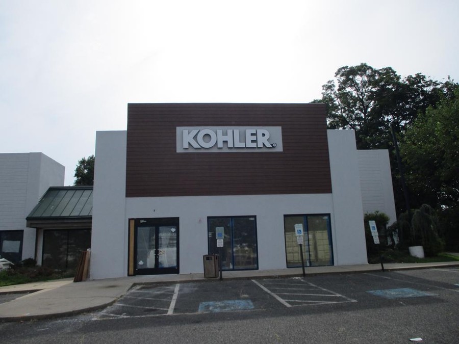
Leveraging the power of change to keep your signage fresh and engaging. Here are some great examples of our successful retail clients:
By periodically introducing banners and other temporary signage, you can renew interest and attract attention to your store. People will notice the change and be more likely to engage with your offerings.
It's important to be aware of and comply with the sign regulations in your area. Different towns and zones may have specific rules regarding signage size, placement, and design. By understanding and adhering to these regulations, you can avoid potential fines, legal issues, and the need to modify or remove non-compliant signage.
We recommend retail business owners work closely with knowledgeable signage professionals who know about local sign regulations. By partnering with experts, you can ensure that your signage not only grabs attention but also remains compliant with local laws and regulations.
The way your sign is illuminated can make all the difference in grabbing attention, especially during nighttime or low-light conditions. Don't underestimate the power of strategic lighting!
Face-lit signs, with their vibrant acrylic faces and brightly lit aluminum frames, are literally putting your brand name up in lights. They offer excellent readability and grab attention from afar.
For a more sophisticated approach, consider reverse-lit (or halo-lit) signage. These signs feature aluminum faces illuminated from behind, creating a subtle glow around the lettering. While they exude elegance, keep in mind their nighttime visibility might be slightly lower compared to front-lit options.
Matching the right lighting to your design is crucial. Complex logos or intricate details might benefit from strategic lighting techniques to ensure maximum clarity. Lighting can also set the mood, creating a welcoming ambiance or drawing attention from a distance.
In today's digital age, technology offers exciting opportunities to elevate your retail signage design. From interactive digital signage to dynamic displays, incorporating technology can captivate your audience and create memorable experiences.
Consider integrating elements like touchscreens, videos, or digital billboards into your signage strategy. These interactive features can engage customers, provide useful information, and even drive sales. By embracing technology, you can set your store apart from the competition and create a modern, immersive shopping experience.
Every business deserves signage that reflects its unique identity and attracts customers. Here at Loumarc Signs, we understand that one-size-fits-all solutions simply don't cut it.
That's why we offer a custom-centric approach to crafting eye-catching, bespoke signage solutions that elevate your brand in the eyes of potential customers. Whether you're a bustling restaurant or a sophisticated boutique, our team collaborates with you to create signage that speaks volumes about your brand.
Ready to make a lasting impression? Contact Loumarc Signs today. We'll guide you through the process, ensuring your signage perfectly complements your brand and sets you apart from the competition. Let's create a visual statement that shines as brightly as your business! https://loumarcsigns.com/#contact-form

At Loumarc Signs, our partnership begins with a strategic conversation, aimed at understanding your vision and aligning our paths towards your grand success. Our expert team is here to generate clear expectations, answer your clarifying questions, and foster a beneficial relationship built on mutual understanding. We are not just sign makers, we are partners on your journey of recognition and achievement, always ready to provide the guidance you need.
Once we grasp your objectives, our team at Loumarc Signs will tactically survey your sign location, capturing every detail to create a design that embodies your brand. Utilizing our experience, we ensure your vision is accurately manifested with an image that stands out. Our goal isn't merely execution; it's the successful amplification of your brand's visibility in the marketplace.


With all approvals in hand, our expert team at Loumarc Signs stands poised to transform those designs into compelling, brand-enhancing awareness. We're here to remove weight on your shoulders. Throughout this transformative journey, we'll maintain clear, calculated touch points, keeping you informed on milestones such as zoning approvals. Our strategic partnership grants you more time to focus on your core business, while we handle the art of making your brand's image resonate in the marketplace.
Having been a business owner I know what it means to desire great brand visibility. I'll be your stratgic partner to greater brand awareness.
Everyone's journey and goals are different. We understand that we're a step towards those goals. Reach out and tell us your vision.


At Loumarc Signs, we are seasoned craftsmen, artfully elevating your brand's visibility. Since 1994, we have proudly served New Jersey, New York, and beyond, nurturing brands with strategic precision. Our commitment is not just to create signage, but to provide a tactical advantage that amplifies your brand's awareness, recognizing its worthy image.
Let us join you in the journey of transformation and evolution, where your brand's success is also our success. With our partnership, your brand's appearance will inspire and awaken understanding.